In our endeavours to better our web-site, Theatreland Online, we must evaluate other sites and compare them to ours. This is necessary for two main reasons: does their site have a higher net equity than ours, and if so, why? We do this by evaluating the site in various different categories. These categories are listed below, with explanations as to why these categories were chosen.
A 400Mhz Pentium-II PC with 128 MB of RAM with a 56.6 KBPS modem using Netscape Communicator 4.5 was used to view each of the sites.
The sites which will be evaluated are TimeOut London Online (http://www.timeout.com/london/), and UK Theatre Web (http://ww.uktw.co.uk).
General Strategy
The general strategy of a web site is the answer to the question "What is this site trying to convey across to the user?" To decide what the strategy of a site is we must look at it objectively: without using any known pre-conceptions, we look at the site as if we have never looked at a web-site before, and try to discern what information the site is portraying to the user.
Interactivity and Usability
The level of interactivity that a site maintains depends on how a site maintains a certain level of depth that can keep a user enthralled. The depth to which we are referring to is that the site must act on the user. The user should feel as if it isnt interacting with a dumb terminal, but with an information source that knows what the user would want to know and pre-empt the user by displaying the information before the user would like to see it.
For a site to be usable, it must be open with regards to its navigation, both in the site structure, and the adequate placing of links. The site should not "paralysis" the user on any of its pages. Users should be able to use the site as easy as it they were using a book: the user should be able to jump to any section on information with very little effort.
User Experience
The
subject of user experience is different from person to person. One might
enjoy surfing through the site as it is as aesthetically pleasing as is
informative, yet another may find the entire site dull and boring. As this
is the case, the use of profiles will aid in visualising what people from
all walks of life will view the site. The four profiles that will be used
are the following:
| Name |
|
|
|
|
| Age | 18 | 31 | 45 | 65 |
| Occupation | Student | Housewife | Senior Manager | Widow |
| Family | Working parents | Husband, 10 year old son | Wife, 15 year old daughter | 2 sons, 3 daughters |
| Enjoys | Sports, Friends, TV, Music | Food, health, fitness training | Sports, finance, fishing | Food, playing bingo online, fitness, health |
| Media per day (unless specified) | 3 Magazines, 3-4 hours of TV, 1-2 hours of surfing | 4 magazines, 1-3 hours of TV, 0.5-1 hour of surfing | 2 magazines, 1 newspaper, 1.5 hours of surfing, 0-1 hour of TV | 3 magazines, 1 hour of TV, 1 hour of surfing, 2 books per week |
An attractive site has a well laid out, structured feel to its pages, and it also must be attractive to the eye. There are many ways to look at a site with regards to its design. The following gives an outline how the sites will be evaluated with regards to its design.
Metaphorical Design Verses Thematic Design
Good sites are designed either using a theme or a metaphor. A thematic site is one that uses a consistent theme throughout the web site. Themes can be visual or conceptual. Examples of themes can be art deco, typographic, futuristic, etc. A good thematic site is one that is subtle, consistent, and displays good information design. The concept gives more emphasis to the creation of a site that pleases the senses while serving the business needs.
A metaphorical site pulls in visitors and makes them feel at home whilst giving them something and somewhere to explore. Metaphors are familiar and consistent. Examples of metaphors are museums, environments, comic books, etc. Some sites on the web make good use of their metaphor (e.g. http://www.finemagazine.com), yet others can get so caught up in their use of their metaphor that they forget about their content (e.g. http://www.kidstown.com, http://www.planetoasis.com). A good metaphor places items where the user expects them to be. For example, a good metaphor puts the light switch where you expect to find it, and bad one makes you learn a new set of commands to enter. For a metaphor to be effective it needs to be light and effective.
Image Use
The use of images within a site can be indicative to the skill level of the design team who created the site. Images, when used on a web site, must be used to complement the sites main content, not pre-empt the content. A good site will use quality graphics in a subtle manner such that the user does not concentrate on the content. That is not to say that a site should be devoid of any graphics, just that the graphics should complement the main content the graphics may indeed be the main content (e.g. http://www.disappear.com does a good job on their site. The graphics that are used makes the user want to buy their products!)
Page Layout
Designers the world over have a large problem when it comes to laying out a page on the web site. The simple reason is that the users browser may not have millions of colours, the specific fonts that the designers has at their disposal, or the dimensions of the users screen. Therefore, a good designer will create a web site that can be viewed by all users yet still maintain the "concept" the designer was trying to get across.
The general structure of the page should remain consistent throughout the site, maintaining the concepts the designer created when designing the site. A good site would have information placed right where they should be.
Designers have no way to know what connection speed their users are most likely to have, therefore they should try to keep the download times for their pages to a minimum.
Site Structure
There millions of surfers around the world, and this number is growing on a daily basis. To attract these potential surfers, a site needs to have an attractive site structure. This includes several factors, such as the quality of the entry tunnel, the core page, and the exit page.
The issue a site structure also refers to the general topology of the site. A good site would have a clear structure throughout the site; a bad one would have its pages spread out in a chaotic fashion.
Net Equity
The concept behind net equity lies behind how marketable the site is, and how valuable it is if it were sold. Net equity can be generated in a number of ways, as long as the end result proves that the site is highly successful or not. Simply put, net equity is audience mind-share, and in net terms, the larger your audience, the larger the value of the site.
The site may increase its net equity in a number of ways, and there is not definitive list of how net equity can be achieved (if there was, every web-site would be incredibly successful), yet various efforts can be pinpointed using a discerning eye.
TimeOut
London Online
(http://www.timeout.com/london/)
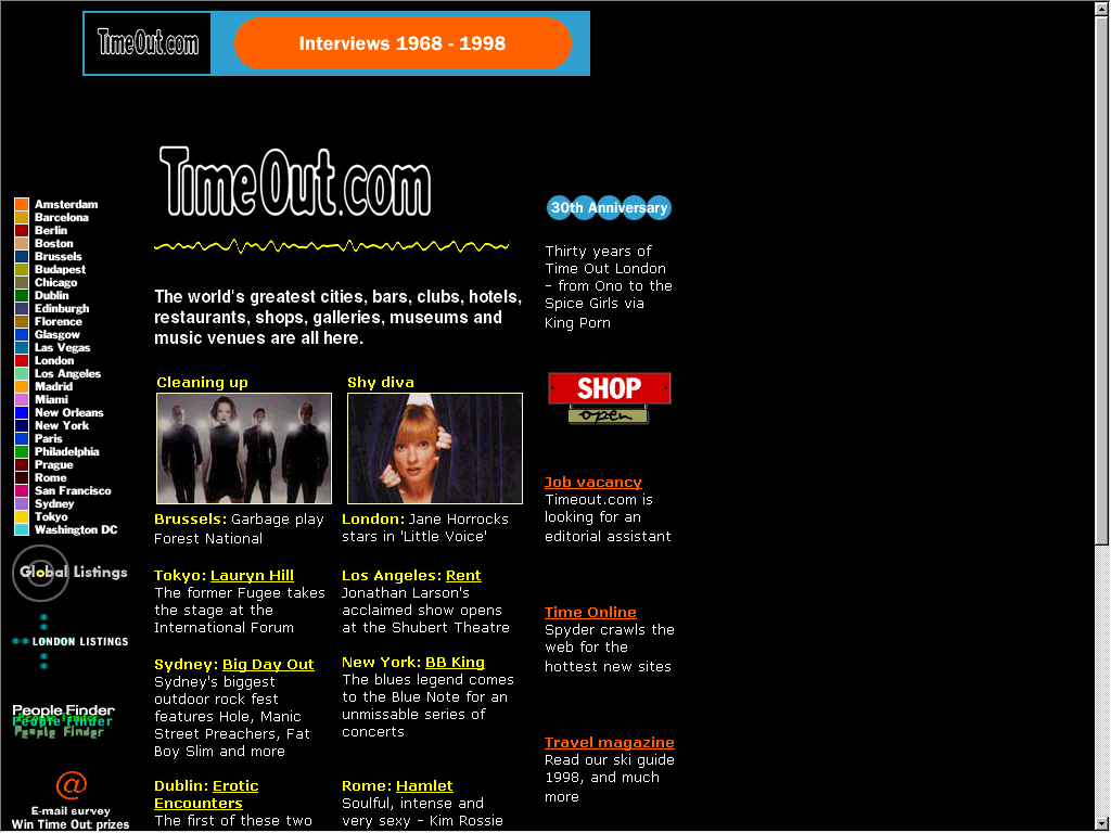
General Strategy
TimeOut is a magazine that informs the reader on what is happening in and around the chosen geographical area, i.e. TimeOut London will tell the reader what is happening in and around London. The magazine is quite informative, and as a reader I find it very useful to plan what to do. The magazine covers all sorts of entertainment areas, such as clubs, comedy clubs, cinemas and film, and theatre amongst others.
The web site itself is an information-based site: it uses a format similar to the magazine version. Information about any particular form of entertainment is shown in "flickable" categories (flickable as the user can "flick" through the magazine just as easily as the web site). The information is displayed in two types of format: short reviews, and long detailed articles.
The added bonus of being online is that TimeOut can be global in one issue rather than several different publications: from the main menu the user can go direct to various "global" location (shown above).
Interactivity and Usability
TimeOut online has a high level of interactivity: the information displayed is informative and written in a casual manner that is maintained throughout the site: the reviews tell the user what they want to know. The information is laid out in such a way that information that the user is looking for is complimented by having other pieces of information placed on the same page. This site does a good job of maintaining user interest, as the information shown is readily available, accurate, and interesting.
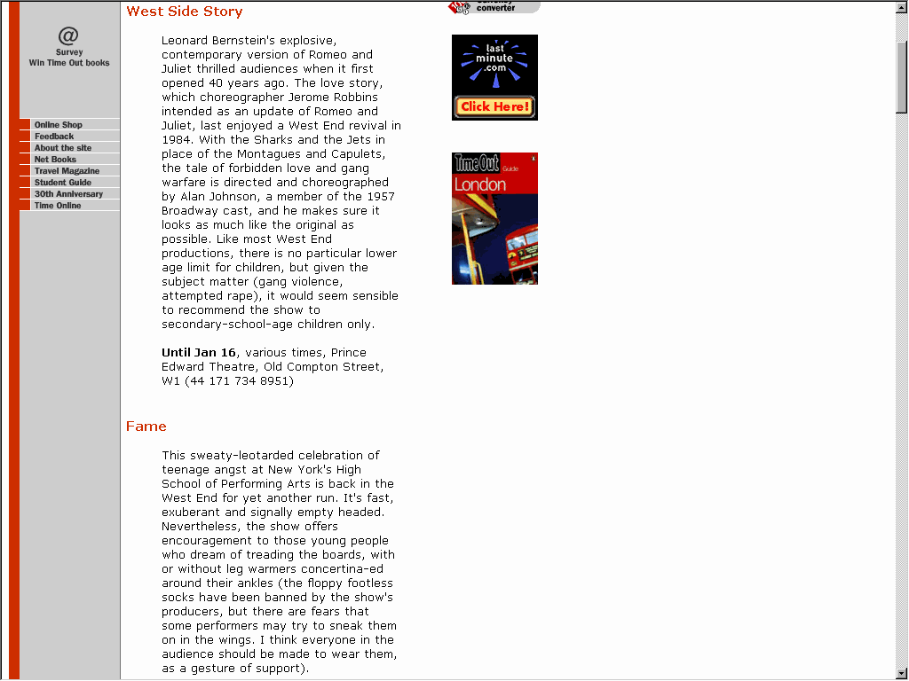
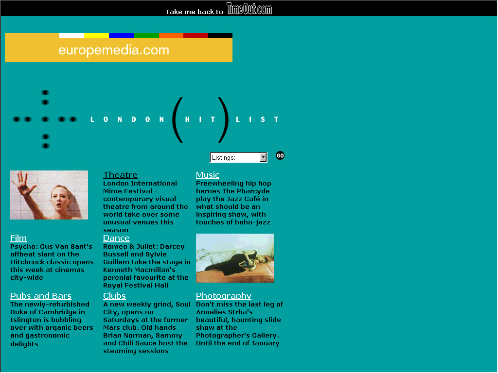
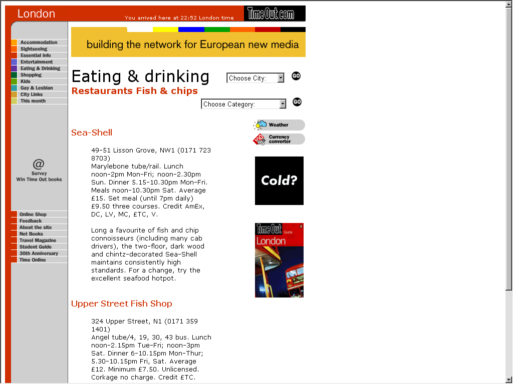
The navigation system used on the site is clear and precise to the users needs. Along the top left hand side of most of the pages is a clear navigation bar, allowing the user to go to various categories of the selected city they are currently in. Some of the pages have no distinct navigation bar, but still have visible navigation links (see Illustration 3). The user never encounters a page that leaves them stuck or paralysed. On most of the pages are drop-down menus that allow the user to go to other cities or categories. The main menu / home page for TimeOut online doesn't have any of these pull down menus (see Illustration 1).
User Experience
Burt
Burt is your average 18 year old, and likes to find sites on the 'Net that are "hip" and adhere to the current standard of "youf" culture. The chances that Burt would use TimeOut online to find what out he wants to do are quite slim as he's not really allowed to go clubbing and stay out till late on his own. The only aspect of TimeOut's site which may interest him would be the cinema's section, but he usually listens to what his friends think about the film, and watches "MovieWatch" on Channel 4 to find out what's good and what's not on the silver screen.
Anne
Anne is quite a regular user of TimeOut online, as her husband and herself enjoy going out, when they get the chance. The care of their child is quite demanding, so if their son is with a babysitter or with his Grandparents for the evening, the couple goes out. Anne doesnt buy the magazine regularly, because she finds all the information she wants on the 'Net, and stops at the TimeOut site from time to time.
Ernie
Ernie hadn't heard about the TimeOut site until he found his secretary viewing it one day. He had seen the magazine on the shelf whenever he used to buy the paper in the morning at the train station, but never really bought it. Having seen the reviews of several West End theatre productions and reviews on other good nights out, he now visits the site often for a brief view. Since becoming a regular to the site, Ernie has also started buying the magazine once a week.
Sandra
Sandra never goes to the TimeOut site: she's seen the magazine on the shelf, but is quite intimidated by it. Young people buy that magazine to plan out their social life. Unfortunately, Sandra doesn't have the same amount of energy as the young people of today, so her social life doesn't take her all round London.
Design Concepts
On first viewing the site when one reaches the main menu, the user knows straight away how most of the site will be structured. The front page gives a clear indication that the site means business. There are no entry tunnels to entice the user to enter the site. The site cuts through this and starts showing the user the information they want to see.
The entire site uses the classic "magazine" metaphorical design, one that many sites have used. The layouts of the pages have a feel that designers wanted to differentiate the online publication of TimeOut from the magazine publication, but didn't quite succeed. The site still has a feel of a magazine about itself.
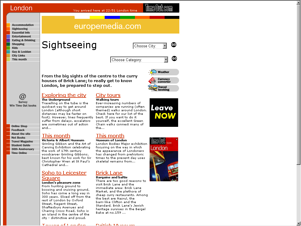
The designers have made clever use of images. The only images used are those used for:
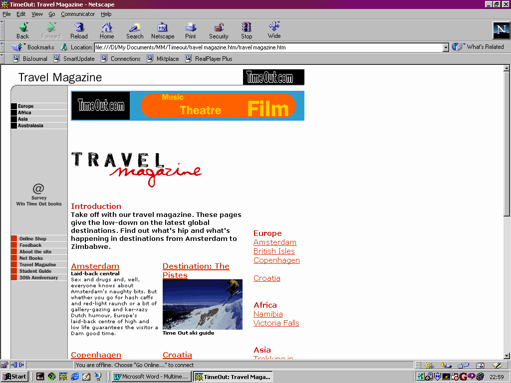
Each individual page was well laid out. Text and images did not clash or interact with each other poorly. The images used complimented the text, and did not overpower the user. The colour scheme used was quite basic in that only a palette of basic colours was used for the GIF-based images.
There was a consistency over the use of various fonts used on the site. Several pieces of text used Verdana as its primary font, followed by Ariel and Helvetica, whereas other pieces of text used Arial first followed by Verdana and Helvetica. Although the end result on the screen didn't look odd, one can only but wonder if the designer did not code the pages properly.
The site was created with the user resolution set at an 800 by 600 resolution, with at least a 16-bit colour resolution. The site did not make use of any frames, although did adopt the now-standard menu bar to the right of the screen.
Each page loaded up fairly quickly over a 56.6 KBPS modem, and this would cause no discomfort to the user.
Site Structure
As has been mentioned before, there is not entry tunnel. There isn't an exit page either. The user visits the site at its homepage immediately. The key to the attractiveness to this site is the quality of the information held in the site. There are reams of information one this site, although most is not as detailed as in the magazine issues.
The general topology of the site is a hierarchical one: the user visits the main menu, and then has to drill down to get whatever information he or she wants. The user is also able to go to any other sub-section of the site as well.
Net Equity
The level of net equity of TimeOut online is very high for many reasons. The largest reason is that TimeOut online is an extension of an already well established publication. Users will go to the site because TimeOut's publications are of a high standard, and they expect the same from the web site.
The site is of a high standard because of its high degree of information available to the user: a professional journalist who has experienced whatever they are writing about has written each article or review. As mentioned before, there is a lot of information throughout the site and plenty of areas of entertainment which TimeOut online covers.
TimeOut online has the ability to try things that the magazine publication cannot do because it is on the web. These innovative approaches to develop their site makes their net equity higher as more users will be curious what is new on their site this week or month.
Their site allows the user to order TimeOut city guidebooks, view its selection of Travel magazines, as well as enter various TimeOut surveys amongst others.
A vital item to have to increase the net equity of any site is to have a recognisable domain name, and TimeOut have managed to have one which has their own name in it.
UK
Theatre Web
(http://ww.uktw.co.uk)
General Strategy
The UK Theatre Web (hereon known as UKTW) is a site that dedicates itself to displaying information about various theatre genres. The site has information on theatre productions happening around the United Kingdom, as well as jobs information, and gossip on what is happening in the theatre industry.
The site aims itself at the "professional" theatre buff as well as "amateur" buffs. Its information it gives within its different categories is highly detailed, with various bits of specialist information added to the main information displayed.
Interactivity and Usability
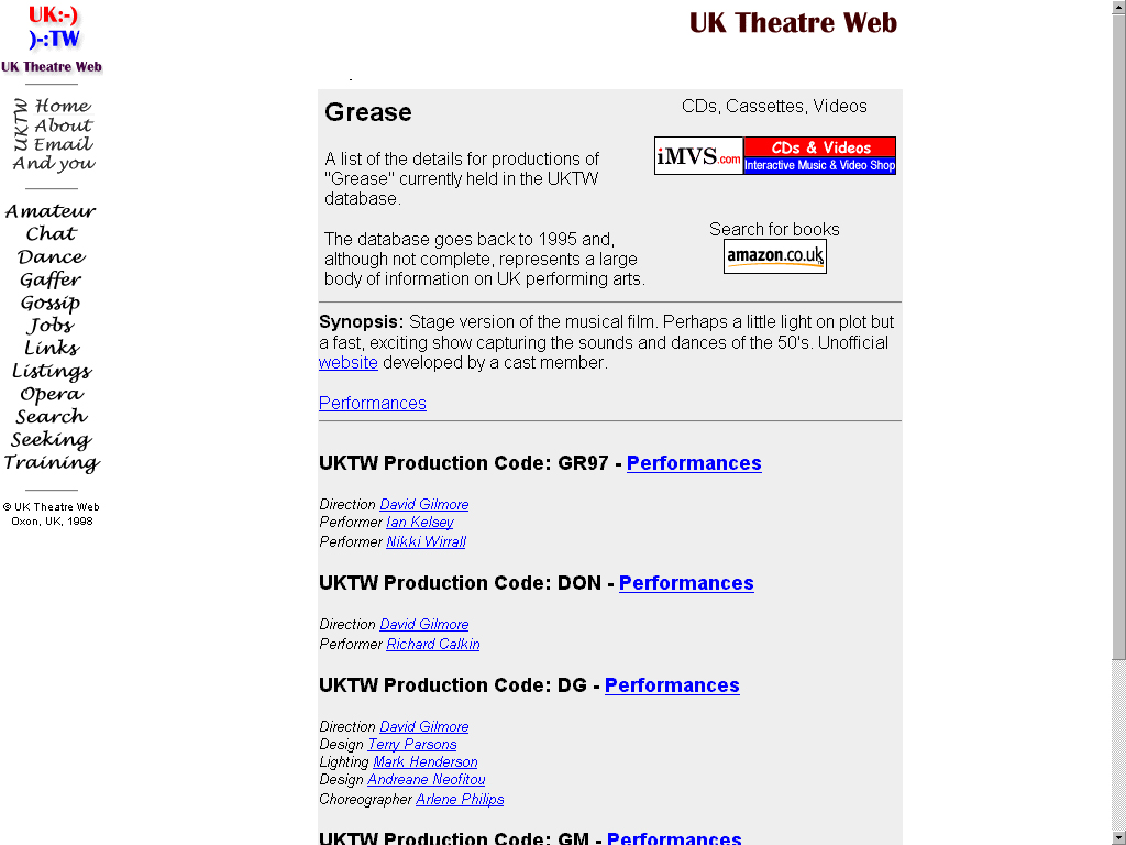
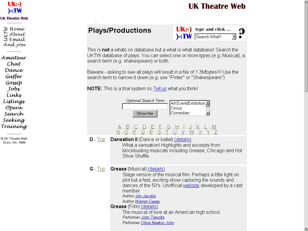
The level of interactivity of the UKTW web site is quite low: the information, when displayed, is set about in a semi-chaotic fashion (see Illustration 7). The information that the user wishes to see is set half way down the page, and this information is displayed in a similarly chaotic manner. The text is hard to read because it has been written in a convoluted manner that takes general notes format rather than a piece of creative writing.
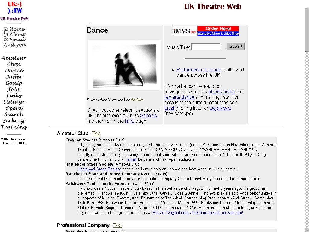
The navigation system of the site is clearly marked: the designers used a frame, with the smaller left hand side being the navigation bar, and the larger right hand frame being the content frame. The designers choose to use the standard colours for the text - Unread hyperlinks stick out, as they are marked blue. The user is sent into a state of paralysis, as the navigational frame on the left-hand side is there throughout the site (see Illustration 8).
User Experience
Burt
Burt views this site whenever he is involved in any of his school play productions. He finds it useful to pick up tips on how to hone his acting skills. He's thinking about going into acting school, and regularly checks the sites course lists to see which courses are available and how well rated these courses are. Although he visits the site often, it took a while for Burt to get used to the site as the general look and navigation system of the site was quite poor.
Anne
Anne visited the site once, but quickly went to another site. She didn't have time to go through the site to find whatever she was looking for. Beside, the site was unappealing to graphically, so what sort of information would site have?
Ernie
Ernie stumbled onto this site from the "Yahoo!" search engine when he wanted to book tickets for an opera production for him and his wife. He went through the site and found the exact information he wanted. He was quite surprised, as accurate opera details were hard for him to find, and has since been to the site quite regularly.
Sandra
Sandra visited the site once because one of her friends was in an amateur play production, and their producer put details of the play up there. After a long search (and phone bill!), Sandra found her friends play. She wasn't a regular user of the site, and probably never will be, despite the fact that the information, once decoded, is useful, using the site is quite hard
Design Concepts
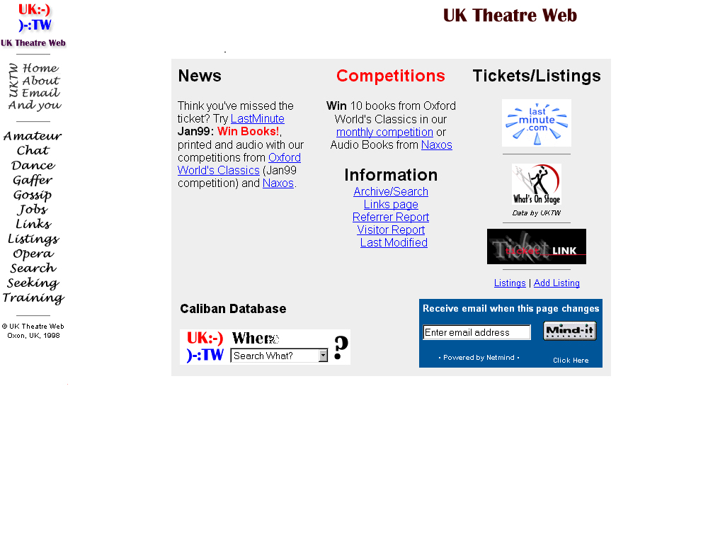
The user enters the site straight onto its homepage, whereupon the navigation bar is shown clearly, and some "cover page" information is placed out in the content frame (see Illustration 6). The general look and feel which the user gets from seeing the front page denotes that perhaps the last time the site was updated was at least over 18 months ago (an eternity on the web).
The entire site uses a thematic approach to its design, and a rather basic one at that. The main colours used are monochromatic (see Illustration 9). The text is either black or dark blue. The site maintains this feel throughout the site.
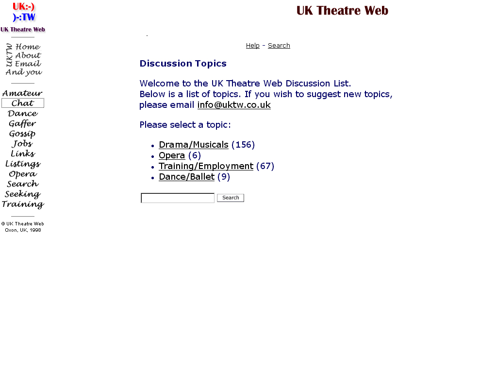
There is some use of imagery in the site. Both GIF's and JPEG's are used, and each of the images was clear and took little time to download. The navigation bar and the UK Theatre Web logo (found usually in the top right hand side of the content frame) were GIF images: the designers wanted to use their own font, and used images to use them (see Illustration 10). GIF images were also used as small icons. JPEG's were used to show photographic images. The use of images throughout the site was sparse, as the designers relied on HTML coding to provide whatever colour they could (e.g. the table background used on some pages was grey, see Illustration 8).
Each page was laid out quite well, as relevant information was placed in separate tables that had a background colour of grey. This made the information easy to locate, but finding the right piece of information was a chore, as some pages seemed to go on.
There was a consistent use of the arial font throughout the site, as well as the ones used in some of the GIF images
The site was created with the user resolution set at an 800 by 600 resolution, with at least a 16-bit colour resolution.
Each page loaded up fairly quickly over a 56.6 KBPS modem, and this would cause no discomfort to the user.

Site Structure
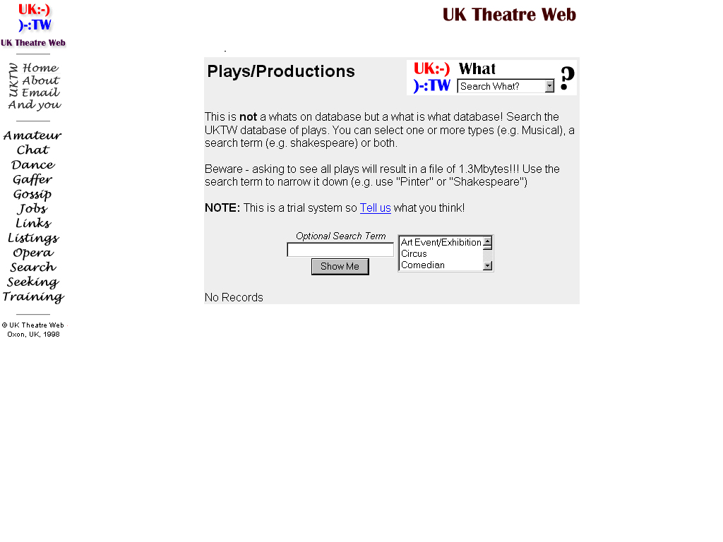
There are no entry tunnel or exit pages in this site: the user finds themselves straight on the home page. As mentioned before, the left-hand navigational frame loads pages into the right-hand frame. The quality of information is average, as there is plenty of information available to the user, but this information is displayed in a chaotic fashion. The search page allows the user to search through databases of companies of actors or individuals, as well as a play's database containing synopses of various opera and plays. It also can search where a production is playing at and allows the user to upload their individual information onto their database.
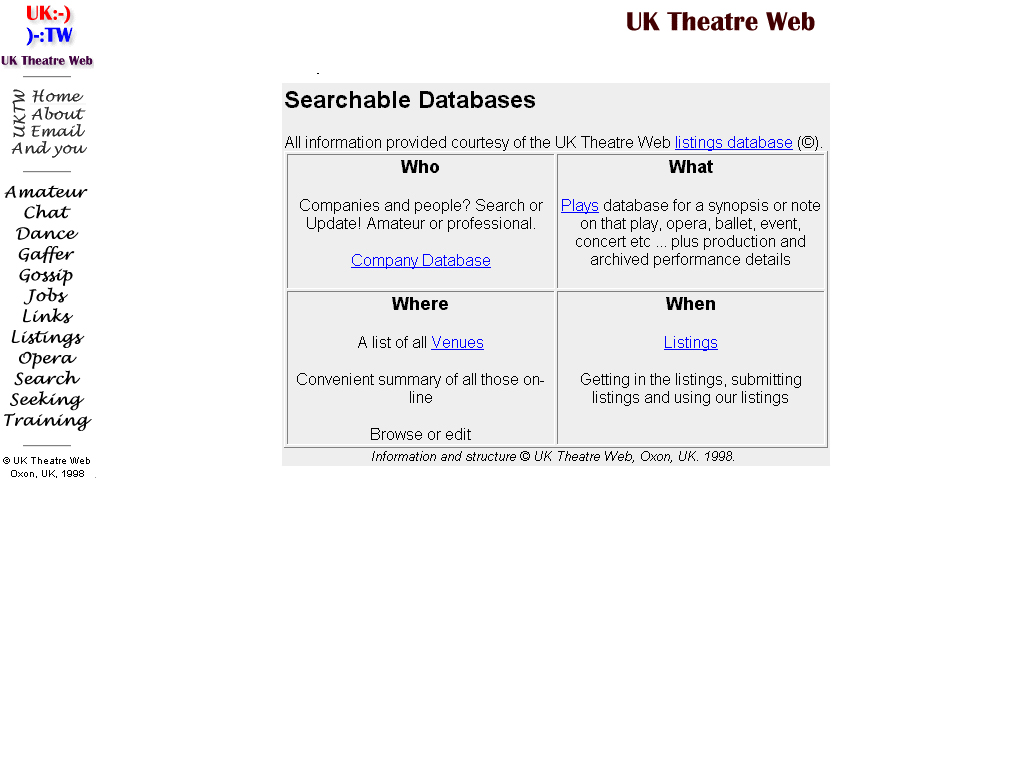
The topology of the site is one of a heterarchical one: the user can access almost any main page from the navigation bar. However, this site uses ASP scripting, and generates pages on the fly. Therefore, users cannot access the information directly, as most of the pages require the user to search for what they are looking for in each individual category (see Illustration 12).
Net Equity
The level of net equity for the United Kingdom Theatre Web is above average for a few reasons. One of the main reasons is that the basic design concepts used are quite lacklustre. There is nothing truly innovative about the site that would "force" the user to stay and browse through the site. A user would not casually browse through the site: they would only go to it if they had to.
The main reason why this site any net equity is that is does hold relevant information for those who do need it and for those who are willing to sift through mounds of text to find the right piece of material.
Conclusion
Both of these sites have been on the Internet for longer than Theatreland Online, and both of the are Theatreland's competitors.
TimeOut online is one of Theatreland's biggest competitors because their net equity far dwarfs Theatreland's. Theatreland Online specialises in displaying information about theatre productions in London's Theatreland district. TimeOut online do this and much more: they have entertainment listings for the whole of London.
The same can be said about UKTW: its information-base covers the entire United Kingdom, and the UKTW specialise in listing only theatrical information.
However, Theatreland Online offers the user a unique experience to explore a virtual Theatreland, where the user can visit individual theatres and explore them. Theatreland Online provides an experience for the user, using different design techniques. The other two do not. They display information in a magazine type format. Users can not become so emerged in their site that they become "lost". This is what Theatreland Online wishes to do in the future. This will be our highest asset, and will provide Theatreland Online with a starting amount of net equity that can be built upon.