- Was the domain name relevant to the topic?
- What feelings of expectation did this present to the end user?
- What is the site trying to achieve?
- What level of content / information did the site provide?
- About the theatre
- About the Show
- Did the site make use of hypermedia available to them?
- Images
- Sound
- Animation
- Did the colour scheme used complement the site?
- Did the site conform to any thematic or metaphorical design?
- Was the site easily navigable?
- Was the site interactive enough to keep the user interested?
- Were the web pages on the site consistent?
- Is the information / �message� the page wants to give you in the �right� place
- Code check � Is it clean?
- Did the site live up to its expectation?
- Why?
- What was the overall impression of this site?
- What is the site �worth� � Net equity
- If Theatreland Online, was a 10 / 10, how would this site rate against it?
- �Screen Shots�
Reviews
The Really Useful Company � The best of Andrew Lloyd Webber (http://www.reallyuseful.com)
Domain
The domain name itself does not seem to suggest any real relevance to the theatre. The caption it comes with however indicates otherwise. Really Useful Company seems to suggest a bank of information just waiting to embrace the user. Perhaps if they could have included the word theatre in the title it may have been more appropriate.
Content
The site focuses primarily on the shows concerning Andrew Lloyd Webber and is trying to show his best pieces of �work�. In terms of content, the site is quite thorough. It contains information about major productions such as; Cats, The Phantom of the Opera, Evita, Starlight Express etc. Once having selected a production the site gives an overview of what the show is actually about, with a historical overview also included. The site does not give any information about the theatre at which any of the productions are being held but it does indicate the cast who performed at various locations, including Broadway, London and the original cast. In terms of content this site is quite informative without giving the show away.
Hypermedia
The site makes good use of hypermedia. Each show is depicted with an image
that is relevant to the production; for example Cat�s has the following image:
Images are simple yet effective. The site does not contain any kind of animation. This is not necessarily a bad point, as the site manages to convey its �message� with static images.
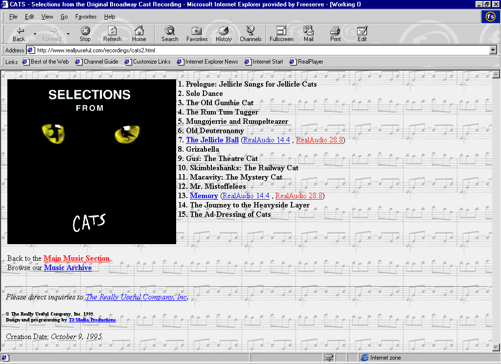
One of the menu options is music, when this section is clicked the end result is the picture of the music CD for the production, with a real audio file that allows the user to hear a sample. This is quite effective, as it does not force you to listen to any sound; you have the choice to decide.
Colour
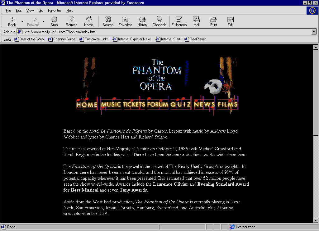
The colour scheme used throughout the web site is effective and consistent. The background on the home page gives the impression of silk curtains, upon which the links to the productions sit. Each of the productions has a black background. This conveys an impression of mystery and anxiety � feelings that are often associated with visiting a theatre in real life. The use of dark colours also makes the site look more tasteful and professional than if loud / bright colours were used. Clearly, this site targets a more sophisticated audience.
Design Concepts
The site does not seem to suggest that any kind of metaphorical design was implemented. However, it does seem to have a dark and mysterious theme about it. The site achieves this with the colour scheme used throughout the site and the use of intelligent images i.e. not to over burden the user with vast quantities, but to put sensible images in sensible places. Whether this was intentional or not is up to debate, but the simplicity of this site is very effective. The site is quite spacious, in that it is not clustered with pieces of text or images everywhere. There is a definite structure to it that the designer has adhered to very well.
Interactivity and HCI:
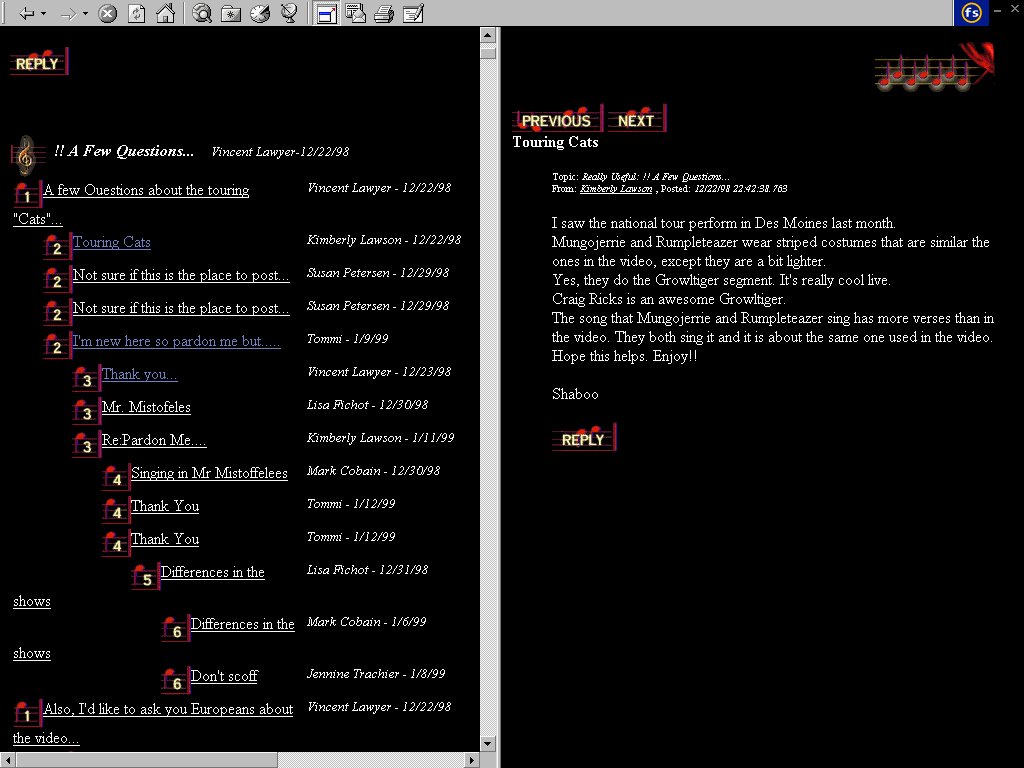
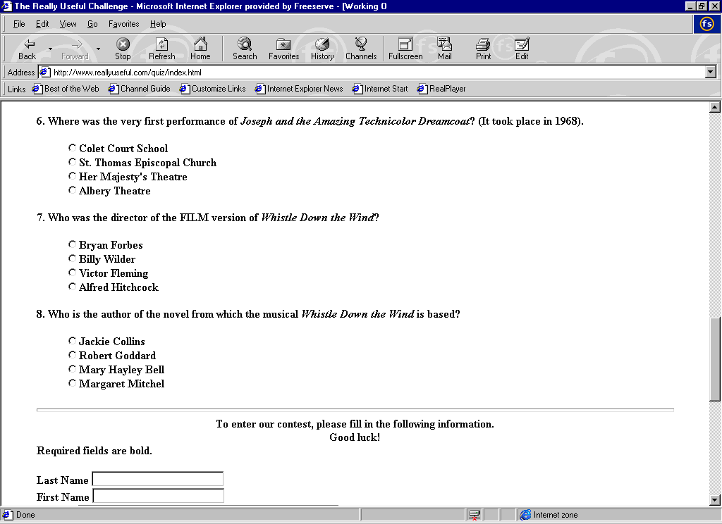
The site is quite interactive; it allows the user to read messages placed on a bulletin board, and if the user registers, they may post articles also. The site also has a quiz, which the users may participate in, which is renewed quite frequently. This is a good design idea as it means that users having visited the site once will want to visit again, in order to take part in the quiz again. This is also a form of interacting with the site. Features such as these, aid in keeping the user interested. In terms of navigability the site structure promotes ease of travel through and around it, with hyperlinks being clearly defined.
Consistency and Page layout
The basic page layout was as follows:
This was consistent on every production title page. This set-up, promoted the thematic design and ensured that the site was easily navigable. However, the web page in all cases was too big to fit on the page and therefore there was a little bit of scrolling involved. To counter this though, the information that a user may be after, such as an image and the review of the production is all available at the top of the screen. This is an example of having the right information in the right place. The code used throughout the web site was clean and laid out in a readable format.
Experience
The initial expectation of the site was that it would contain a great deal of information, in this respect the site lived up to its expectation. In terms of design and the simplicity with which information was conveyed, and the way that navigation was made straightforward, went beyond expectation. The site was informative and designed in a very intelligent manner.
Conclusion
The overall impression of the site was that it performed all the operations that I would have requested it to perform. In terms of net equity, the site did not have a counter and hence the audience it reaches cannot be determined. However, the forum seems to indicate that web-surfers not only visit this site, but interact with it. It seems to have captured an audience and turned it into a virtual community. The price of this cannot be underestimated and therefore would have to conclude that this site has a HIGH net equity. In comparison to Theatreland Online, www.reallyuseful.com is a strong competitor, as it performs all the functions that we are capable of and a few more (quiz, forum real audio etc.) and therefore would lie quite high in the scale. From a personal point of view, the site would get a 10 out of 10.
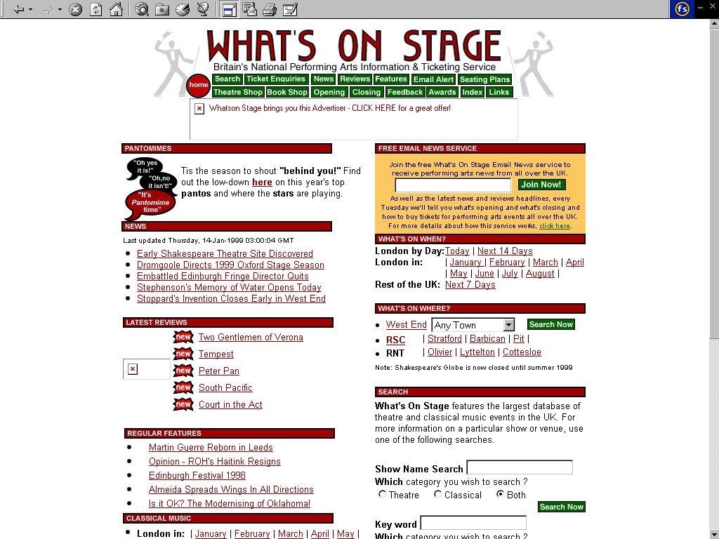
Home Page
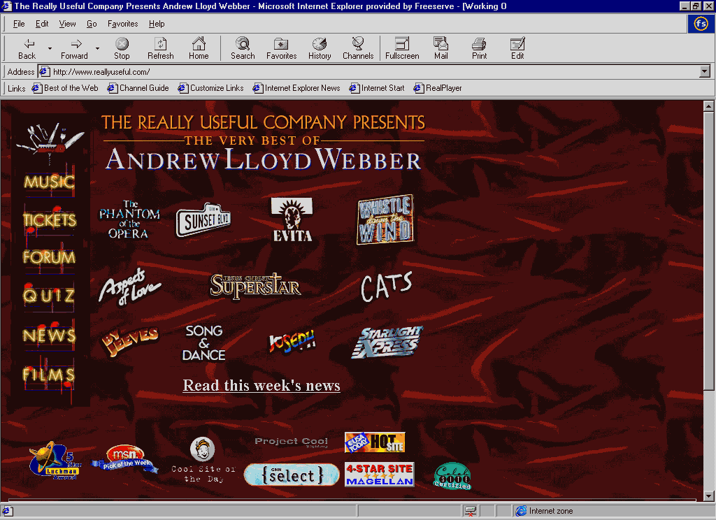
A Productions main page
The Forum
Music screen
The Quiz Screen
What�s On Stage � Britains National Performing Arts Information & Ticketing Service (http://www.whatsonstage.com)
Domain
The domain name for this site is quite superb. When talking about theatre, if there ever was a perfect URL, �www.whatsonstage� would be it. Immediately, it gives the impression that the user will be invited to find out what is on where! The feelings that one may associate with this web site are that of information resource.
Content
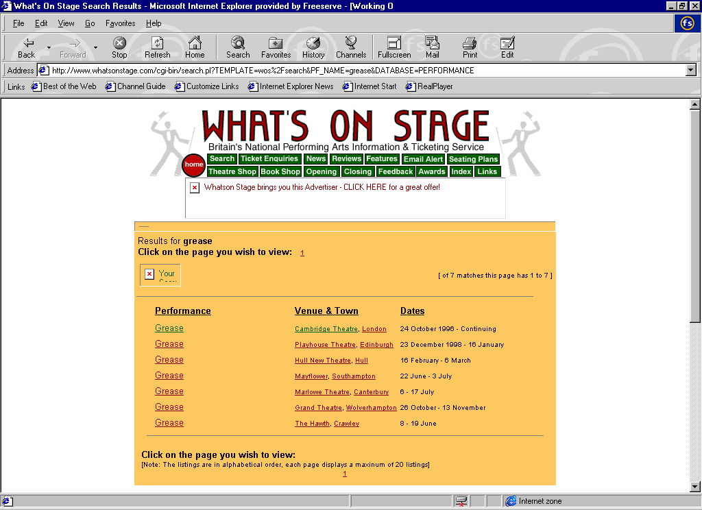
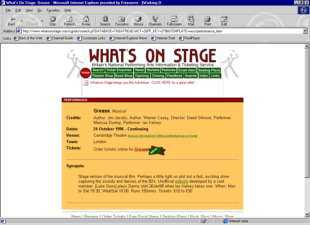
In terms of end content this site is disappointing. It is a search engine for finding out what is playing where. This is a good idea as it covers the whole of the UK, and it can make matches of production and theatre. It is more the out put of the search that is a let down. The users only sees a small piece of text that contains approximately 75 words that gives information about the production, who it is sponsored by, when it plays and how much the seats cost. Needless to say that it is extremely brief. The first site reviewed may be said to contain a lot of information about a small selection of productions. This site contains a small quantity of information, but on a large selection of productions. Hence we have to ask the question which is better?
Hypermedia
The site contains very little imagery. In fact, if a user performs a search, the site does not have a single image about a production. Sound has not been included, and animation is only found on the various banners.
Colour
The colour scheme within this site reflects a search engine. The scheme, in no way complements a site concerning the theatre or a theatre experience. The site uses a white background with text. It is not very eye-catching.
Design Concepts
The site does not appear to be based around any kind of concept. However, it is very consistent. The site conforms to a virtual piece of paper. This is the kind of site that a user would use to find information, which can later be printed out and used as a hard copy reference. In this respect the site achieves exactly what it aims to.
Interactivity and HCI
The site was fairly easily navigated through and around as hyperlinks were clearly defined and everything was arranged in table format. In terms of interactivity, the site, as stated earlier was a place that a user would go to get quick information. Once the information has been gained a user is unlikely to stay at that web site to surf �just for the fun of surfing�. The site is not eye catching and for that purpose will not keep the user interested. But, since it performs a function, it will keep the user from leaving the site before they have got the information that they are after.
Consistency and Page layout
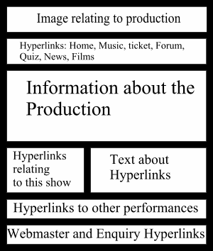
The web pages were extremely consistent. It appears the site uses cgi to generate the content for each page that is placed onto a standard template. Hence at times the code is in a mess. The information that is portrayed is however in the correct place the diagram below helps to illustrate this.
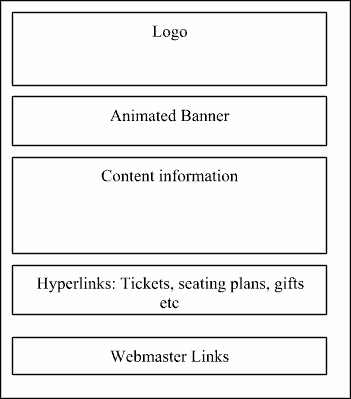
The cgi-generated content would always appear in the same box. This may be categorised as templating, which the site achieved quite effectively.
Experience
The overall experience of the site was shattered due to its nature. As suspected, it did have a lot of information, but sadly the information was at a very basic level. Perhaps, if the site could have included a little more information and incorporated images along with just a simple outline of the production it would have provided the user with a more embracing theatre orientated web site.
Conclusion
The overall impression of this site was that from a theatre point of view, the information it provided was not as in depth as one would have liked. However, from the site objective outlined on the home page, it clearly met its objectives. In terms of net equity, the site is an extremely useful resource for people who know which show they are looking for and simply want to find out where it is on show so that they may book it. In this respect it has considerable value. In terms of its rating alongside Theatreland Online, it is difficult to say as both sites address different functionality. Theatreland Online looks to provide its users with a virtual theatre tour whilst What�s on stage acts as a search engine. Therefore, based on this, the site would rate as a 4/5 out of 10.
Home Page
Search Results
Search Results Screen � Grease
